Case Study: Pophouse HQ2 - Series 1
 Read Below
 Read Below
Case Study: Pophouse HQ2 - Series 1
When we set out to relocate our headquarters in 2019, pre-pandemic, our goals and objectives for the space as well as our design narrative, were highly focused on maximizing space for daily team member use, an equal amount of both collaborative and focus space, a fully stocked and sizeable materials library, and hosting our team and clients comfortably for meetings and reviews. Our design narrative focused on inception of our HQ as a Design Lab, promoting the work we were already doing with clients but also to propel us into continued innovation, testing, and playing. At the time, as with most organizations, our team was onsite 5 days a week and our space had to accommodate daily physical presence as the priority. This included a space plan with decent densification and priority placed on the individual’s footprint vs the collective. When the pandemic hit in 2020 and we all went home to work, we paused our Schematic efforts indefinitely with the idea that we would revisit our plans, the site, and our needs once we had more time to observe the enormous work from home experiment that was unfolding.
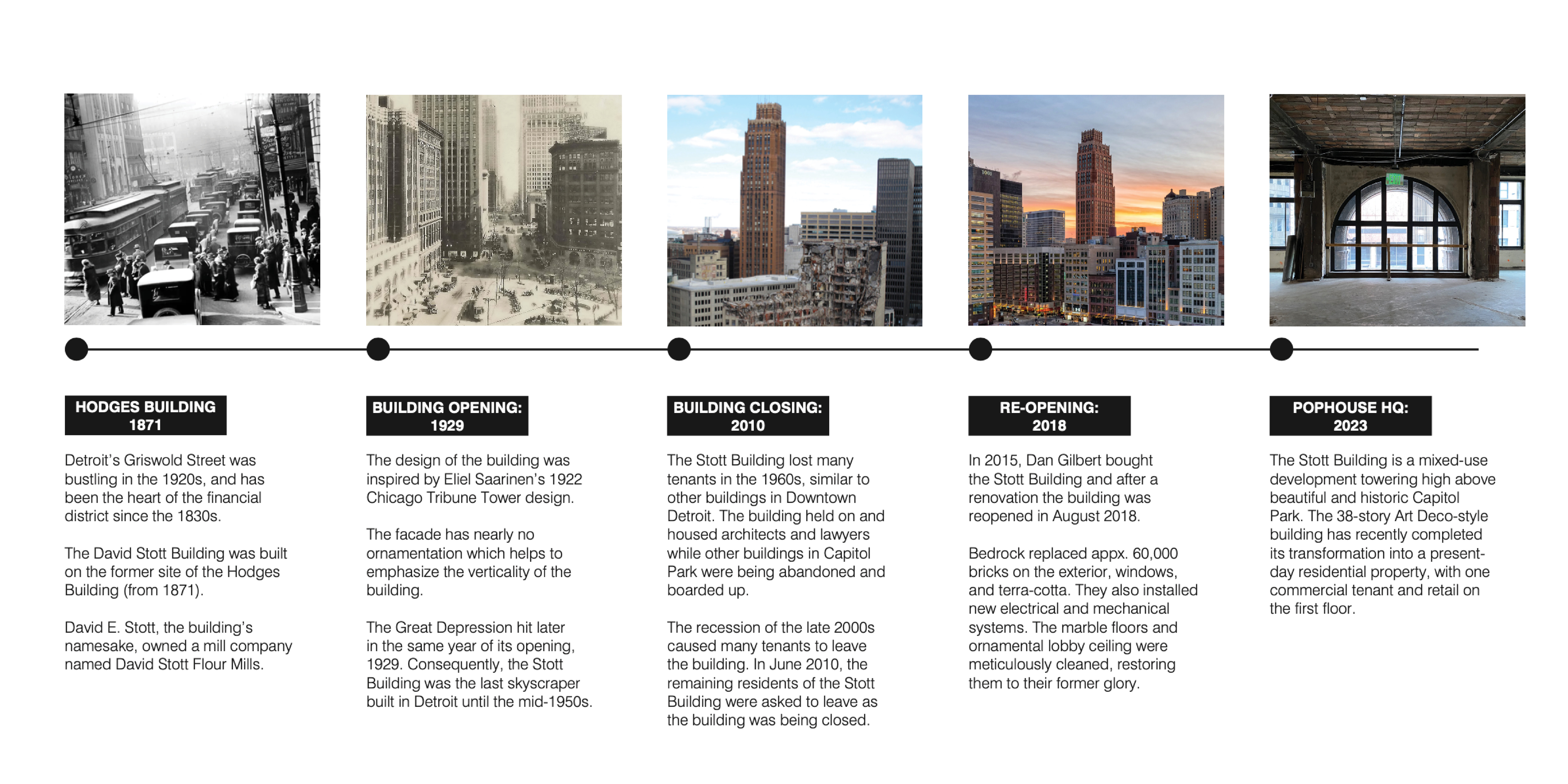
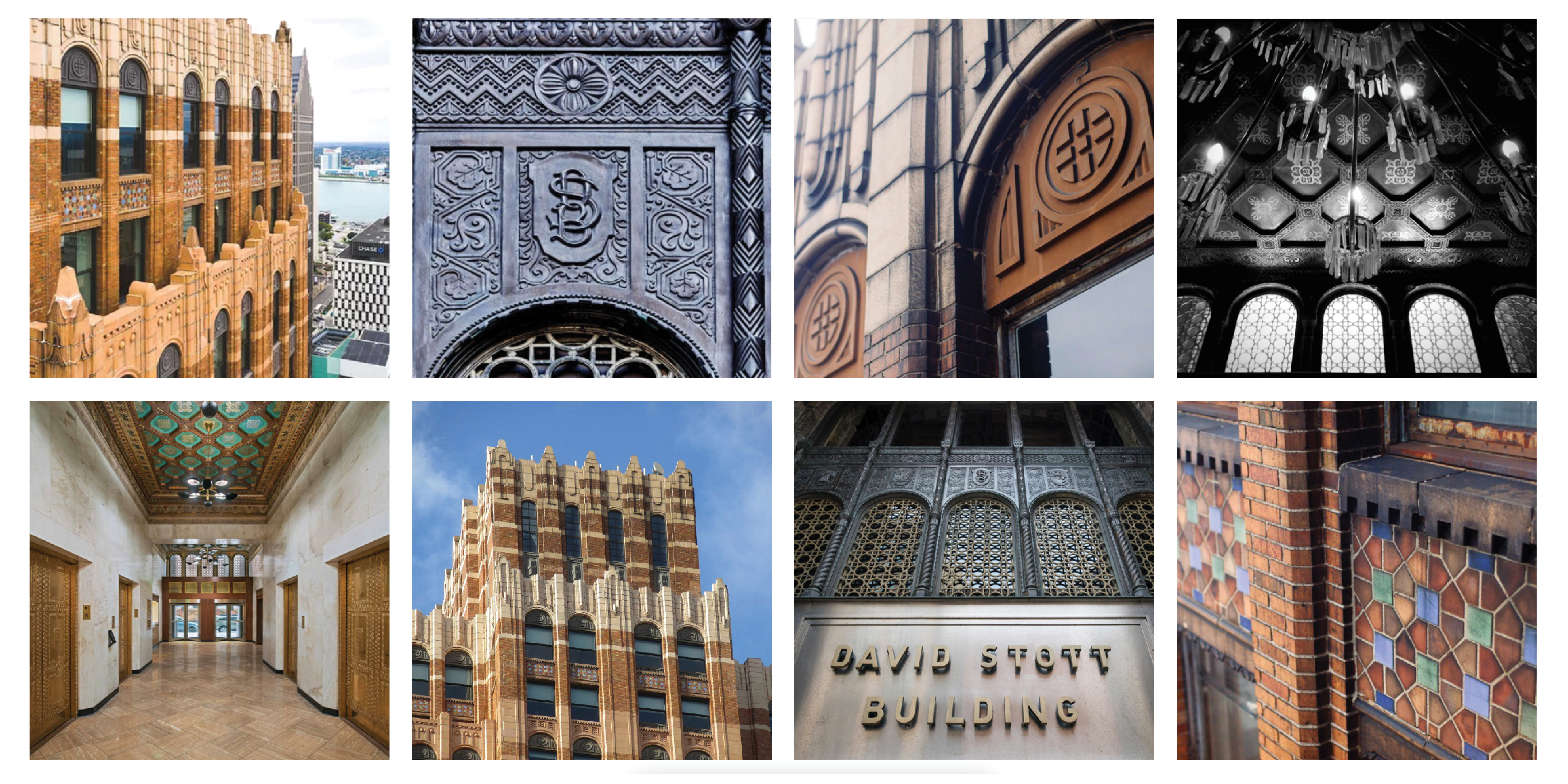
Fast-forward to 2022, our team felt confident in picking this project up again, with the intention of revisiting the site we’d previously selected (a 4th floor suite on Woodward Avenue). We began to consider additional real estate options within the Central Business District of Detroit, with similar square footage to the original site, but increased visibility and connection to the Detroit streetscape and community. We ultimately fell in love with the 2nd floor suite of the David Stott Building in Capitol Park. The historic charm of the site, in addition to the 2nd floor visibility to the street and adjacent Capitol Park community felt invigorating.
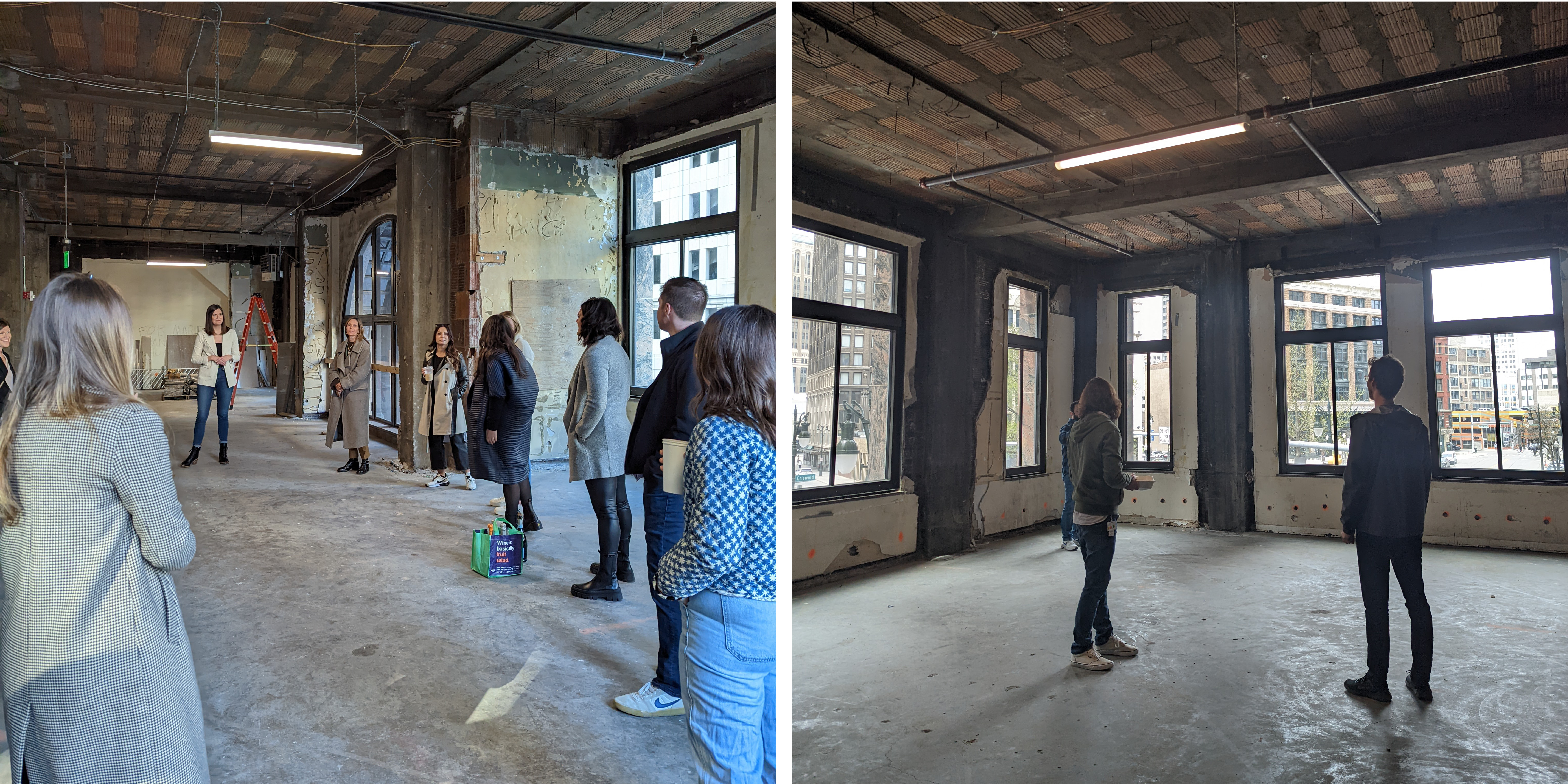
The programmatic development of this new site shifted significantly from our original plans. Knowing our team would operate in a hybrid capacity both currently and in the future, we focused on a balance of individual vs communal space that tipped towards the communal, but also placed a much larger emphasis on hosting clients and the hospitality experience. Rewriting the script of the office and creating a space which would inspire our team, our clients, and our work in both a physical and virtual capacity was paramount.
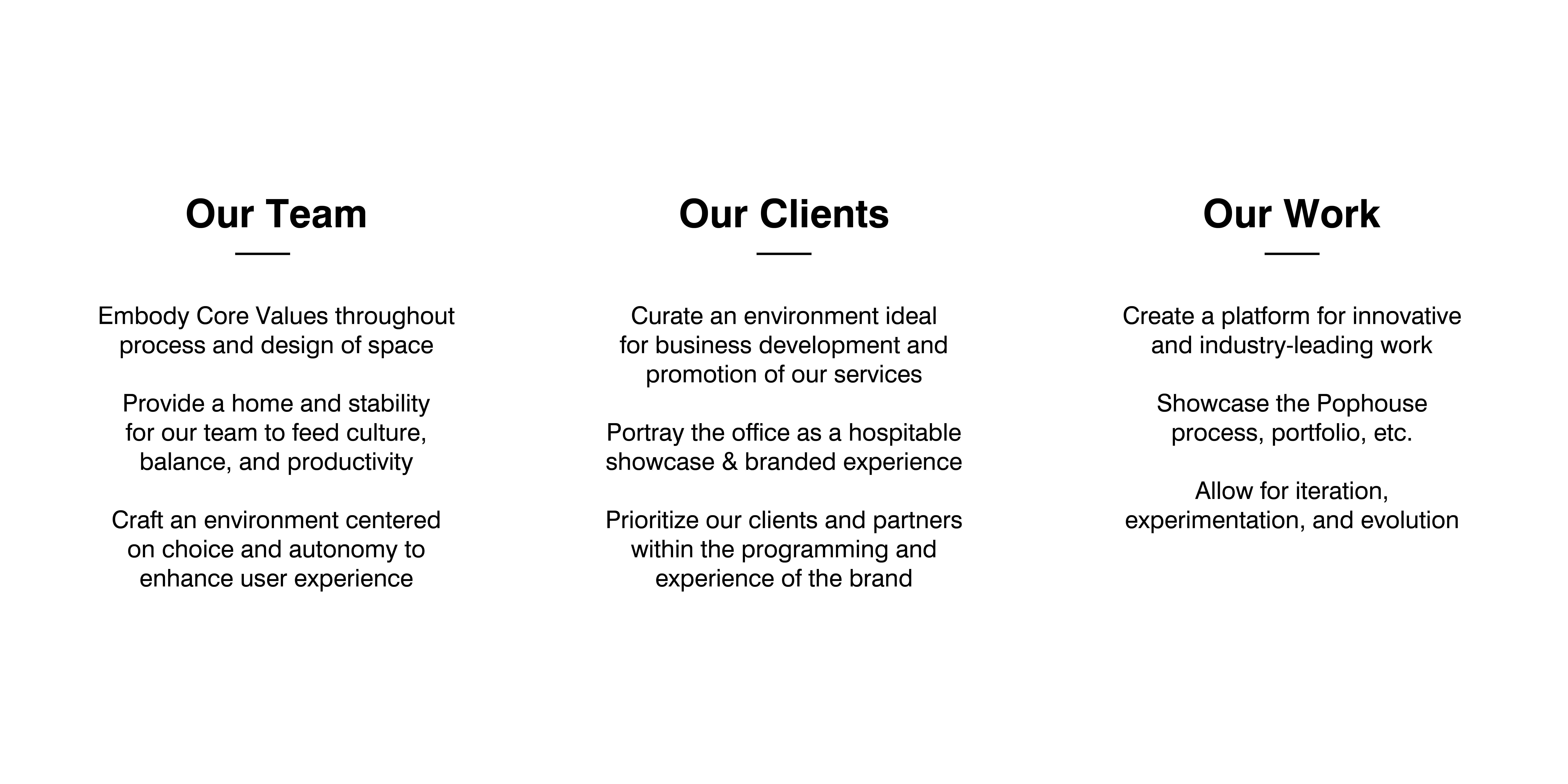
As we began our HQ project, we came together to align on the intent of our new space and what we needed this space to accommodate. Through our dialogue we were able to capture these philosophies which united us together in vision, allowing us to form the foundation of what type of space we needed to support our team.
Craft the Pophouse inception of brand and experience through a new headquarters that supports a diverse and seamless team and client experience, secures our strategic vision for the future of workspace, and inspires innovation and opportunity within the industry.
As we began the process for designing our new headquarters, we leaned into discovery to drive our understanding and set a direction. While we had a core team of individuals focused on the project at the onset, surveying the team was a first step in gathering the voice of the community. We devised a brief survey to collect learnings that would confirm our approach to the space. As we have seen over time with surveying our team, sentiments can shift and change. How people viewed our office before the pandemic and after had shifted, the needs were different and the way we were thinking about what this space would be for our team had evolved. As we analyzed the survey data, we were able to put the results into context of the design decisions for the headquarters. We learned about how people were working and were able to validate programming considerations in the office and share back with the team how we were implementing this feedback.
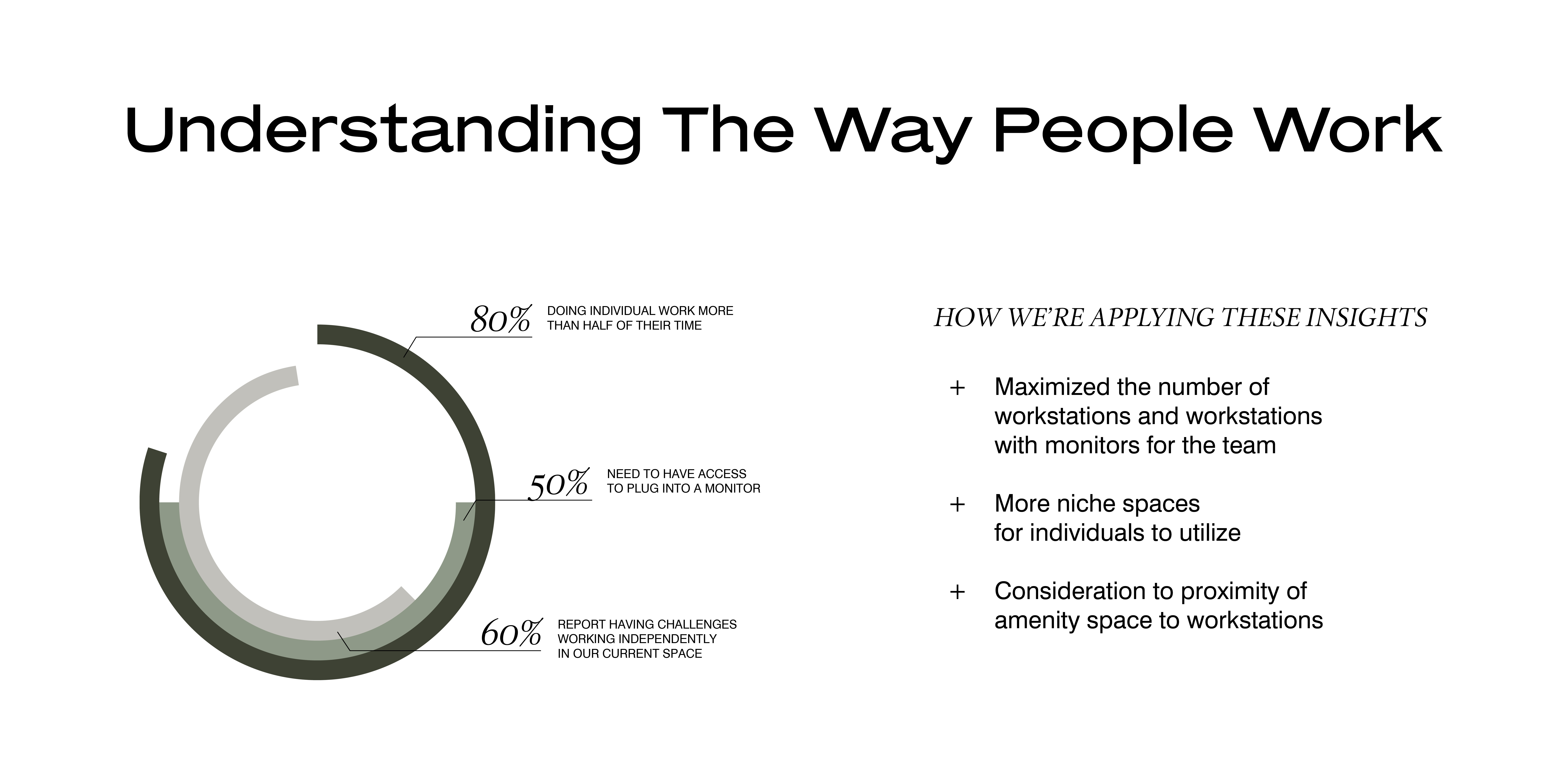
We have found that sharing back with the entire team was a critical step and part of the change management process to keep the company informed during various check points along the way. Our team, like the clients we work with every day, are invested in their office space. These inputs allow us to build holistically with perspective.
While the survey was deployed, our team began discussing the experience that we wanted to have with technology, knowing that we would want to have technology considerations mapped out early on. Technology is no longer an afterthought in the way that people work today. Having certainty that individuals could connect in efficient ways while also allowing the ability to leverage impactful solutions to showcase our work with our clients was paramount. We were able to create a list of what was important to us to have alignment and build a plan:
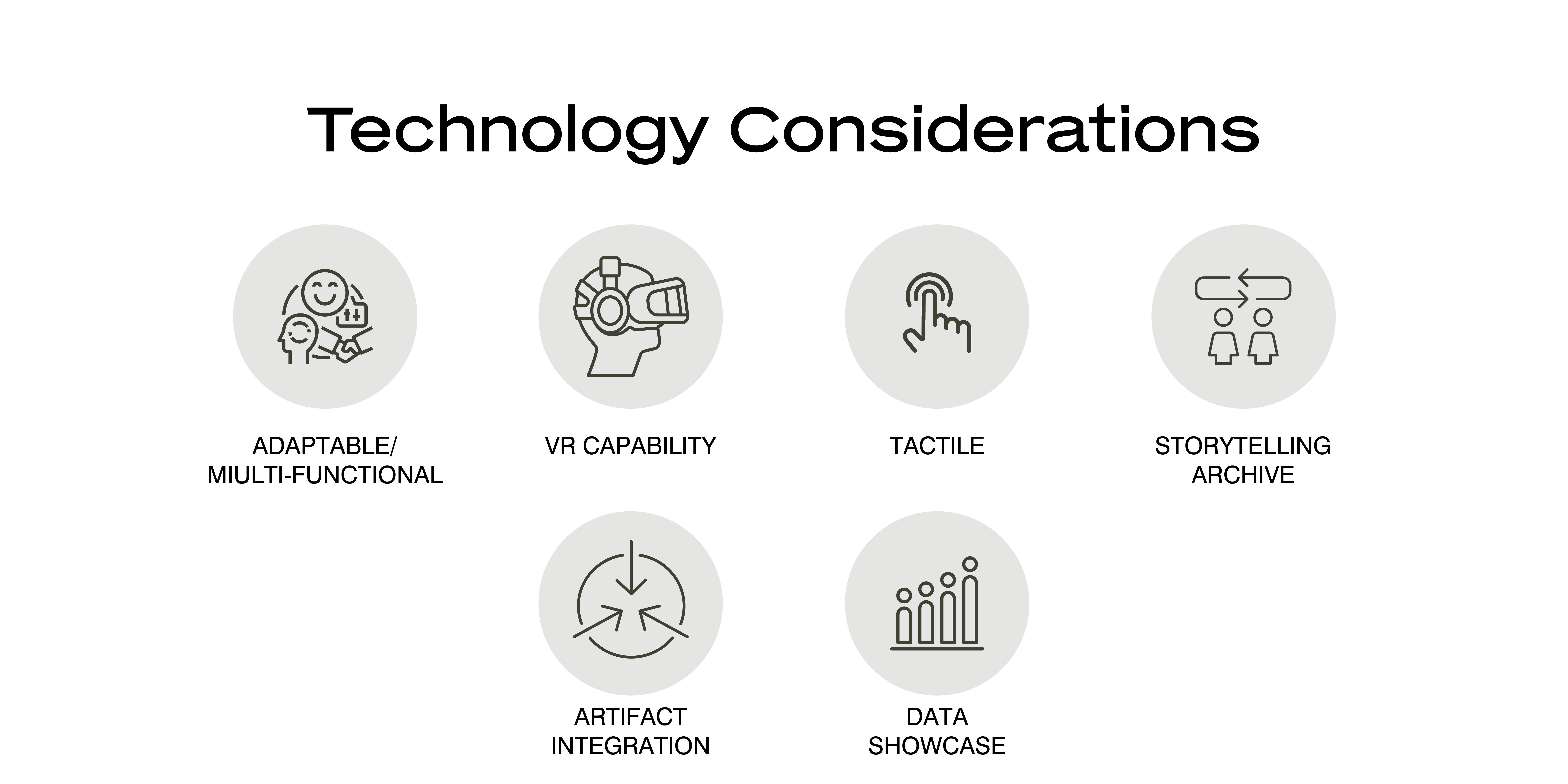
Summarizing these factors kept them top of mind for us as we continued the design process ensuring that we were being intentional with the technology experience from the beginning.
As part of our external research, we captured precedent from spaces that were applicable in form or function to our future office. These provided a trove of content for our team to review together, surfacing detailed features for us to react to. This exercise helped to bring in new ideas and inspiration to continue to challenge our thinking and push our design for the final space. Our perspective for variance in the precedent we reviewed was broad, allowing us to absorb as much content as we could from a spectrum of industries, scale of space and function.
Research and discovery have helped to advance our design, expand our thinking, and push creativity as we worked on the development of our future headquarters. These foundational layers become momentum for arriving at space that is in line with our core values – curious, authentic, purposeful, and fearless.
Our journey designing our new HQ continues to evolve. Knowing the building, setting our objectives for the space, and looking at precedent have set us up to get more detailed in our planning. As a team we began to lean into more nuanced information, allowing us to fine-tune while setting a foundation for the design to come. Determining the expectation for what the space would return to our team, we dialed into how the team needed to operate in the space and the critical “who” – which individuals would this space serve?
During our planning we wanted to capture insights from across the team to narrow in on the intended use of the future space. This use-case planning allowed us a chance to collect a vast range of inputs from the entire team. We began by defining the categories of behaviors that we wanted the future office to support:
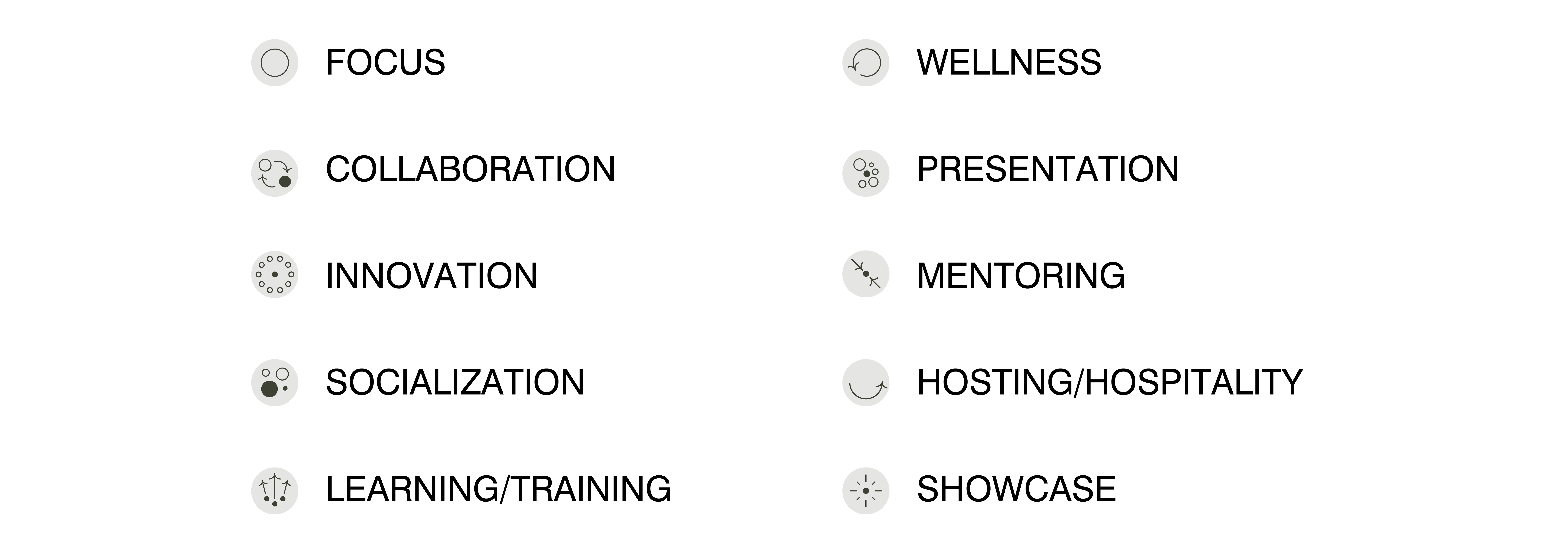
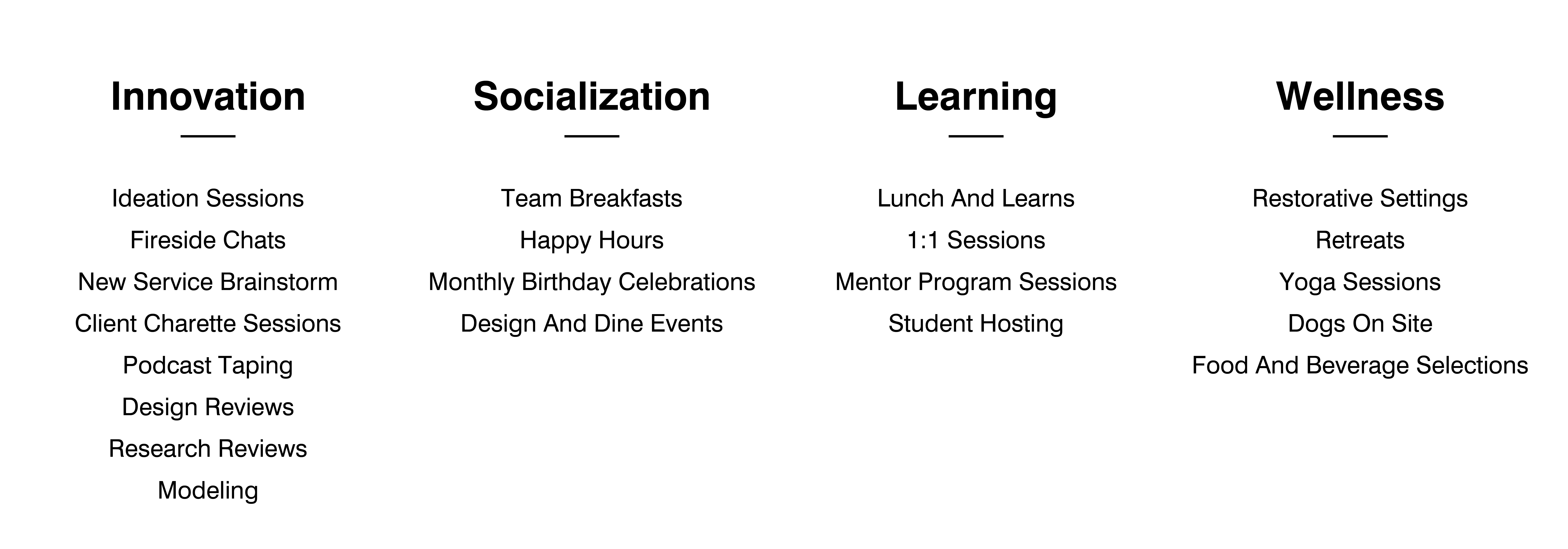
The team expressed the types of functions they would be doing in each of the categories. This allowed everyone to understand rituals that we could consider for the future office to support. The exercise opened discussion for the team to review the shared contributions and have deeper conversations about the needed programming.
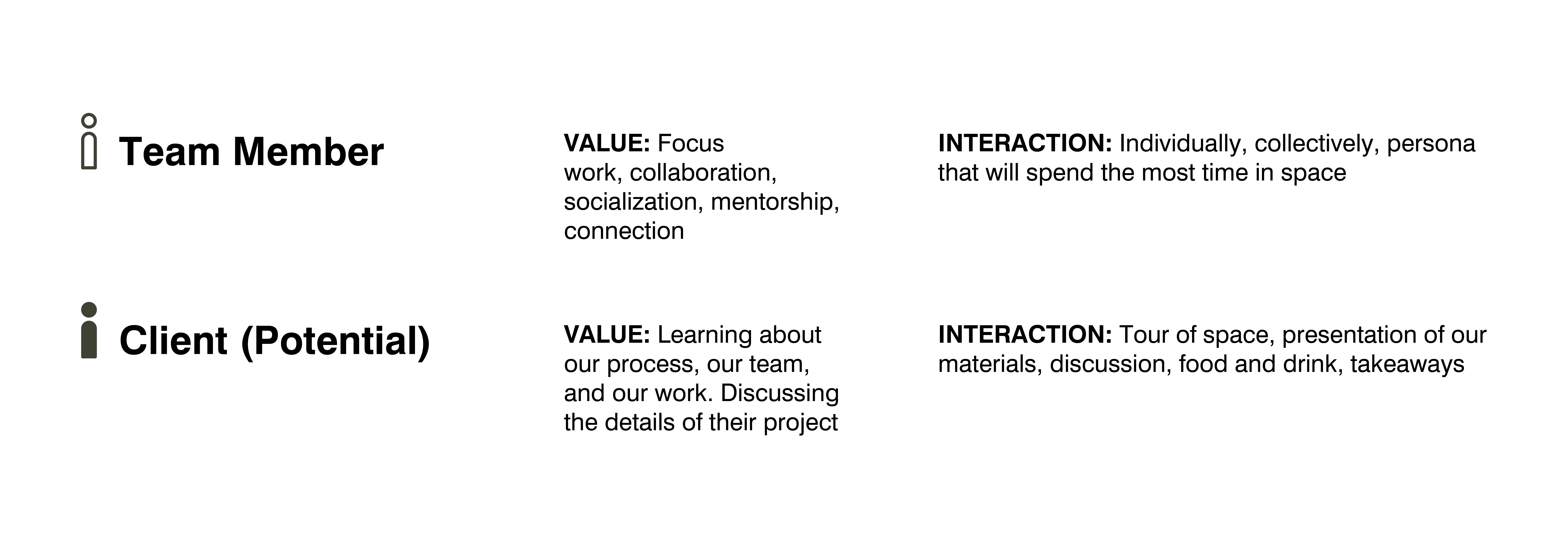
As a team, we listed the various groups of individuals who would be visiting the office. Beyond the team members themselves, who would be coming onsite? This exercise captured the broadest audience and ensured that we were keeping the widest perspective.
Once we had the personas listed, we detailed the ‘why’ and the ‘what’:
• Why was this physical environment meaningful to them?
• Why were they visiting and what was the value of the space to their experience?
From there we looked at the ‘how”:
• How were they going to interact with the site?
• How would the space be impactful to them?
This ideation resulted in being able to develop a detailed understanding of our personas. These personas provide a lens that we can refer to as we design to test our programming, adjacencies, orientations, etc. and to uncover refinements that will ultimately produce the most optimized landscape. Thinking of the office from multiple viewpoints helps us to know that we are designing with the widest awareness that we can and reduces our risk of being blindsided in our planning down the line.
We created a list of personas that would be utilizing our office and detailed what the value of the office was for them and how they would interact in the space. Here are two of the personas we detailed from our list:
With discovery underway, our team feels confident that we have acquired a good sense of the needed functionality that will drive this space to support our team successfully and holistically into the future.
Experimenting with your office can be one of the most effective ways to discover insights and gain understanding about how your team prefers to use space. As our team was moving through the design process for our next HQ, we decided to use our current space to gather feedback that we could apply to our future space. This was around the time that we were coming back into the office more regularly from working fully remote during the beginning of the pandemic and we took that opportunity to adjust the orientation and programming to see what we could learn.
Our office was previously arranged with a workstation for everyone, typical of many pre-pandemic setups. The layout had limited communal space – our team would frequently gather in ad-hoc modes as well as use adjacent, bookable space just outside of our area to meet. However, we recognized that the volume of meetings within the office was now much higher, given everyone gathering onsite together on specific days of the week. As people were coming back into the office, the ability to gather was critical. With an increased volume of video calls, we knew we needed to consider how to handle this with as little disruption to other individuals as possible. Our current space had several limiting factors that we were looking to overcome with the new space and so while this pilot would help us learn, we understood we would still be lacking some key features.
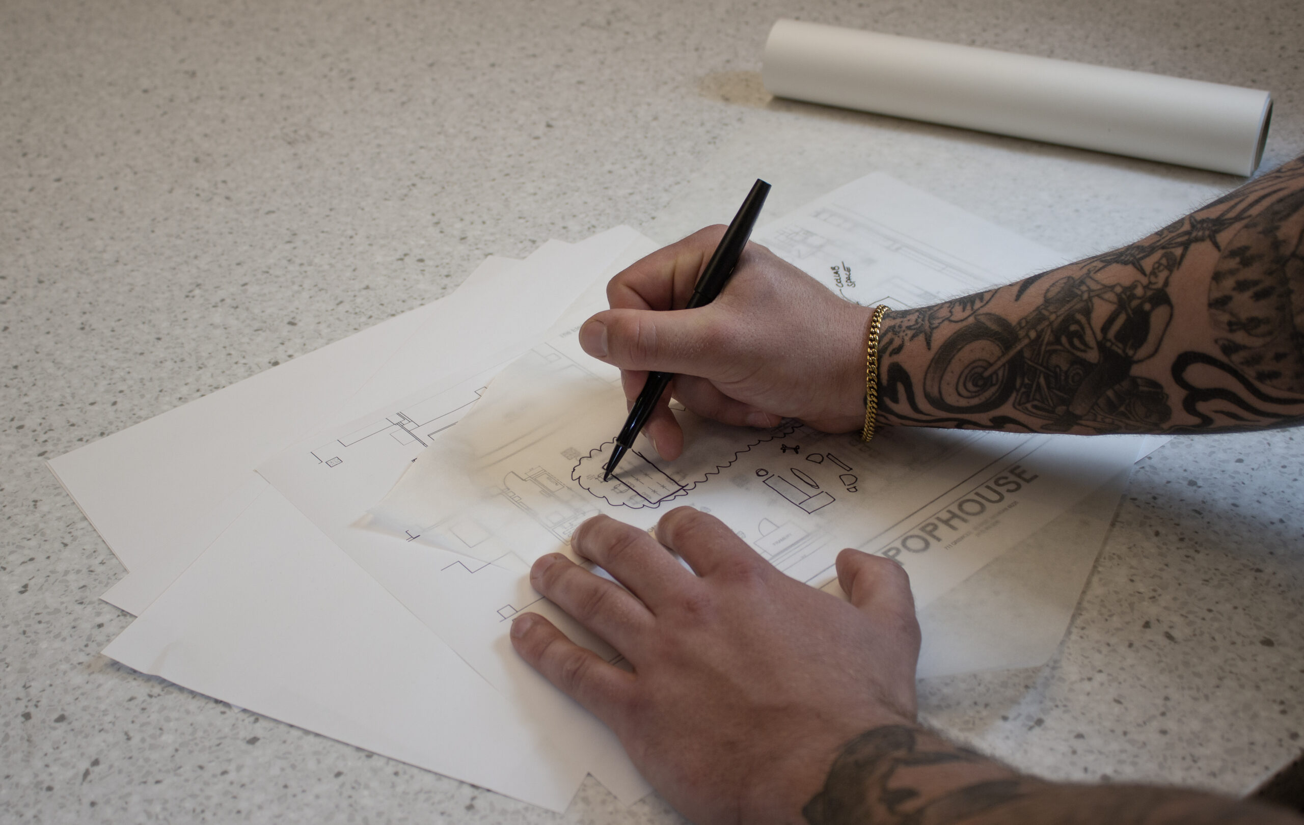
We began with our current layout and determined that if we were able to remove workstations, we could repurpose that space to bring in a wider variety of settings. While there was not a perfect formula to arrive at the number of workstations that we should reduce, we began from a place of knowing what our approximate team presence was going to be and looking at how much space was being freed up from each pack of workstations. This led us to remove half of the workstations. Next, we spoke with our team and used the information from survey results and feedback to understand what further spaces would be beneficial. This exercise generated a list of the types of team spaces that we wanted to introduce – a focus space, small group meeting spaces for individuals to work together, medium sized spaces for project teams to leverage, and a social team gathering space. We knew we would need to be creative given our footprint to align these spaces together successfully.
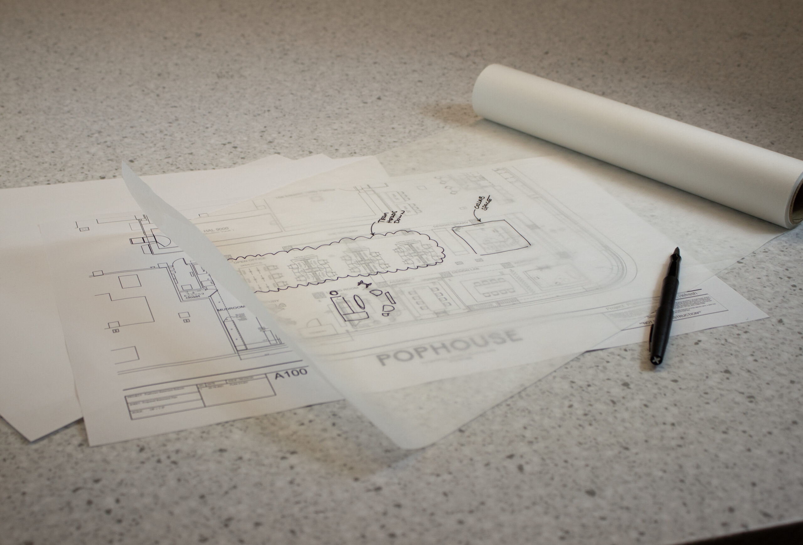
The financial investment in this exercise was minimal as we were primarily testing the function of space and were minimizing spend on product. The plan was to gather learnings and utilize that information to apply to purchases we would want for the new office space. There were a few items we identified we would need to buy to fulfill the pilot landscape. For these items we looked forward and brought in product that we were confident we could re-use in our new HQ space. As our team came back to the office and settled in, we captured insights that made this pilot valuable in decision-making for our future HQ. Here are some of our insights:
Workstation technology: Moving away from assigned seating meant that each workstation needed to function universally for each team member. With both Mac and PC users, we required adaptable tech for anyone to use. We decided to streamline and invest in a new single monitor for each workstation, which allowed for universal docking and also eliminated monitor arms, multiple screens, and extraneous cords on every desk.
Communal technology: Knowing that at any point we could have a mixed-presence group of individuals, we required a tech solution that would effectively unite. As our organization uses Microsoft Teams, we invested in a Teams setup on a mobile cart. This allows us to move as needed while providing the ability to cast team huddles and client meetings. This setup also supports document capture if you are taking notes on an adjacent whiteboard which is helpful for remote participants.
Product: We brought in lounge furniture to build a variety of gathering vignettes for the team. The introduction of a free-standing wall system created a meeting space that could be closed to the rest of the office without needing to build walls. We also invested in acoustical tiles that provide additional noise suppression while contributing to the aesthetic of the office. Lastly, we included a space for cubbies for our team to store personal items through the day while also serving as additional team storage for the office.
Behaviors: Since settling back into the office, we have noticed patterns of behavior amongst the team.
1. The cubbies are not used as much as we had thought for personal storage, but we do leverage consistently for team storage, including brand collateral, design prototypes or mock-ups, and PPE.
2. The open lounge seating is not used as frequently by the team.
3. We use the open team gathering for every team huddle and the Teams setup is effective to run that meeting. This space is used at times by the team for client meetings but as it is not an enclosed room, not used as much for external functions.
4. The team began with sitting in different spaces and workstations, however over time, have begun to settle into certain spaces as a habit.
5. In a world of video calls, acoustics are significantly important to think through. Programmatic adjacencies are vital to consider as well as acoustical products which can help dampen noise.
Creating a pilot with our current space has been very helpful and has involved everyone across the team – a thoughtful approach that aids in change management and the adoption of future space. Our new HQ will be a space that supports the entire team and the work that we do. Our excitement continues to grow as we get closer to fully realizing our new home.
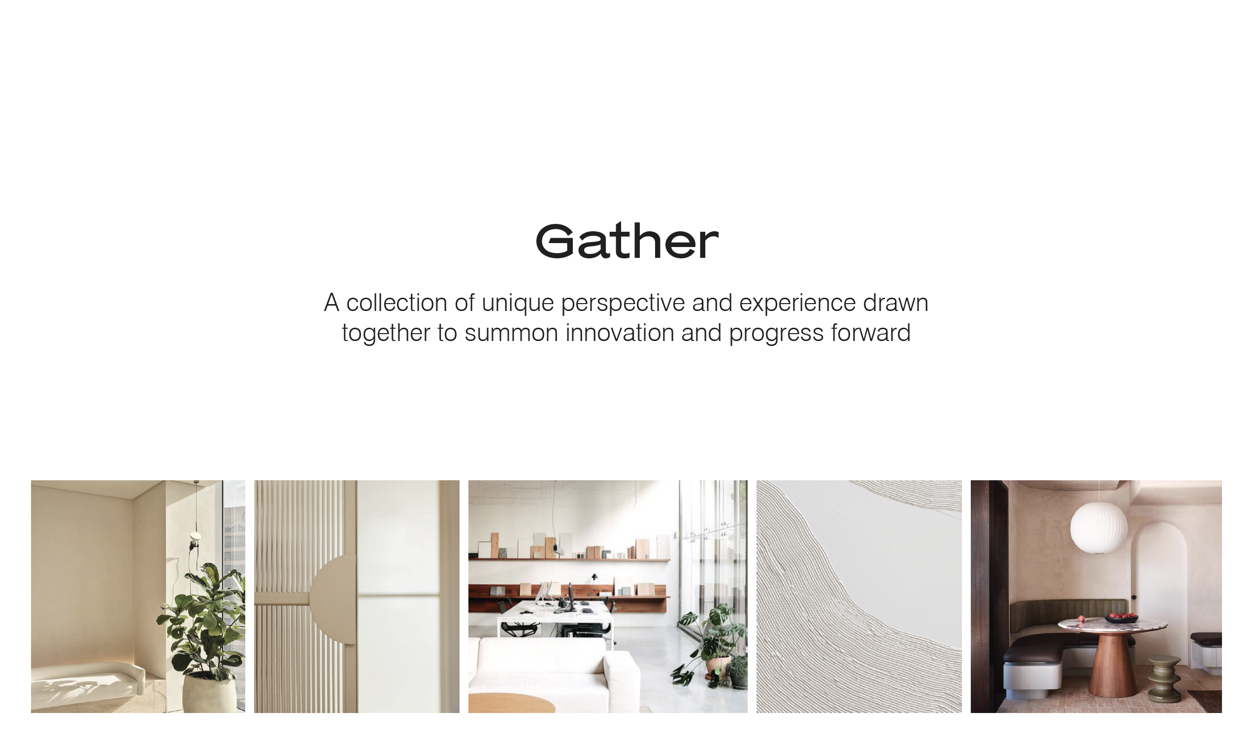
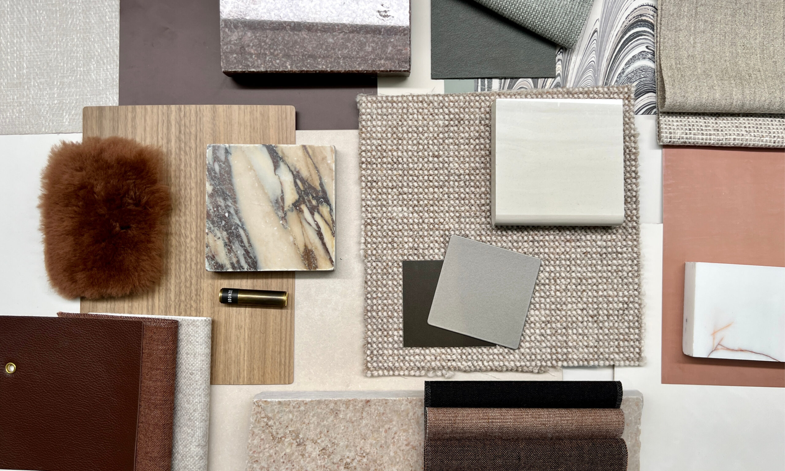
As we considered the best way to tell the Pophouse story, we knew it needed to be rooted in the idea of the collective. Our concept, Gather, speaks to the collection of unique perspectives and experience our team brings together in order to innovate and progress forward in all we do. Our headquarters space will embody this concept as a space to gather and promote connection, process, and mission across our organization. Our design objectives – invite, inspire, kindle, and craft – tell the story of the creative process, while our design principles – intuitive hospitality, nourished being, shared intention, fluid creativity, environmental equity, and the science of play – show up physically within the environment to support our team, our clients, and our work. The mood board is a beautiful way to describe overarching look and feel, the essence of the concept.
Our palette for the space leans into warm neutrals, relying heavily on texture and depth of materials to provide visual layering and interest. Slight accent colors include warm terracotta and an earthy sage, complimentary to our brand palette. We’ve also relied on a heavy dose of black and white within the space to provide contrast and balance, seeking a headquarters that feels sleek and modern while comfortable and warm.
The journey of realizing a design narrative and palette for our new headquarters has been invigorating and challenging at the same time. It has allowed us to discover how our brand, our work, and our team show up in a genuine way, while also pushing us to define how this new space can propel and sustain our team and our work for years to come.
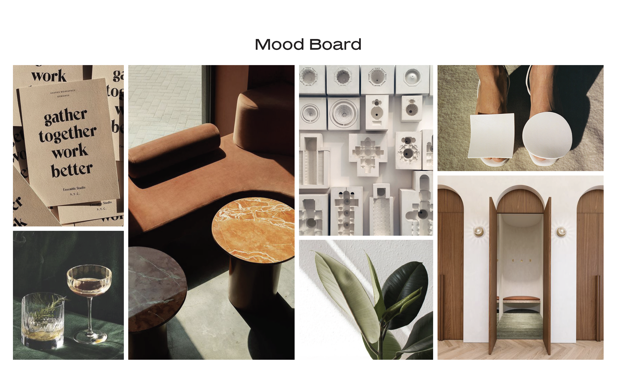
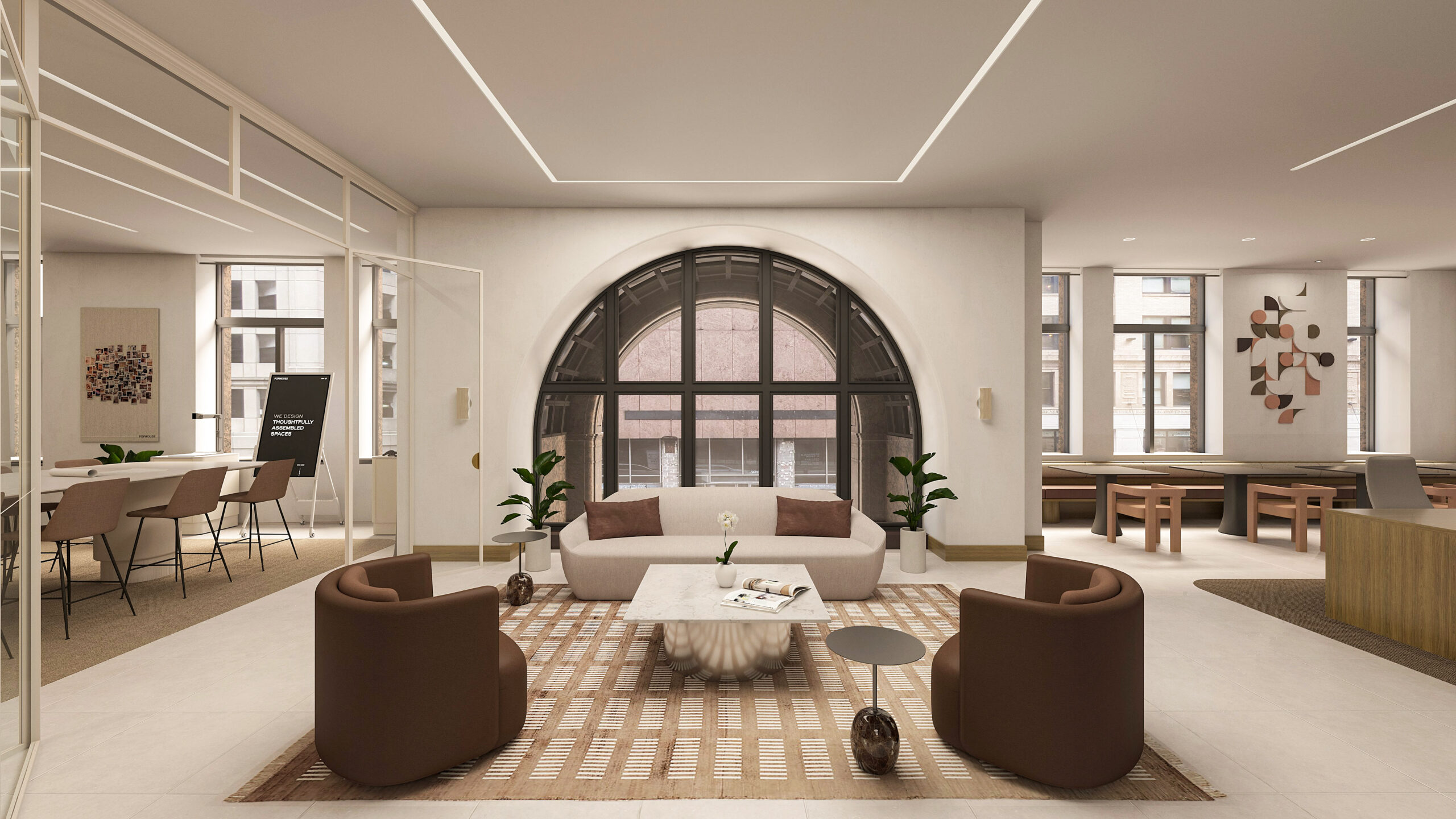
The overall look and feel for our new headquarters evokes a sense of calm, familiarity, and belonging, allowing the Pophouse team and guests to feel at home within the space. The imagery was thoughtfully curated to tie into our core values – fearless, curious, thoughtful, and authentic.
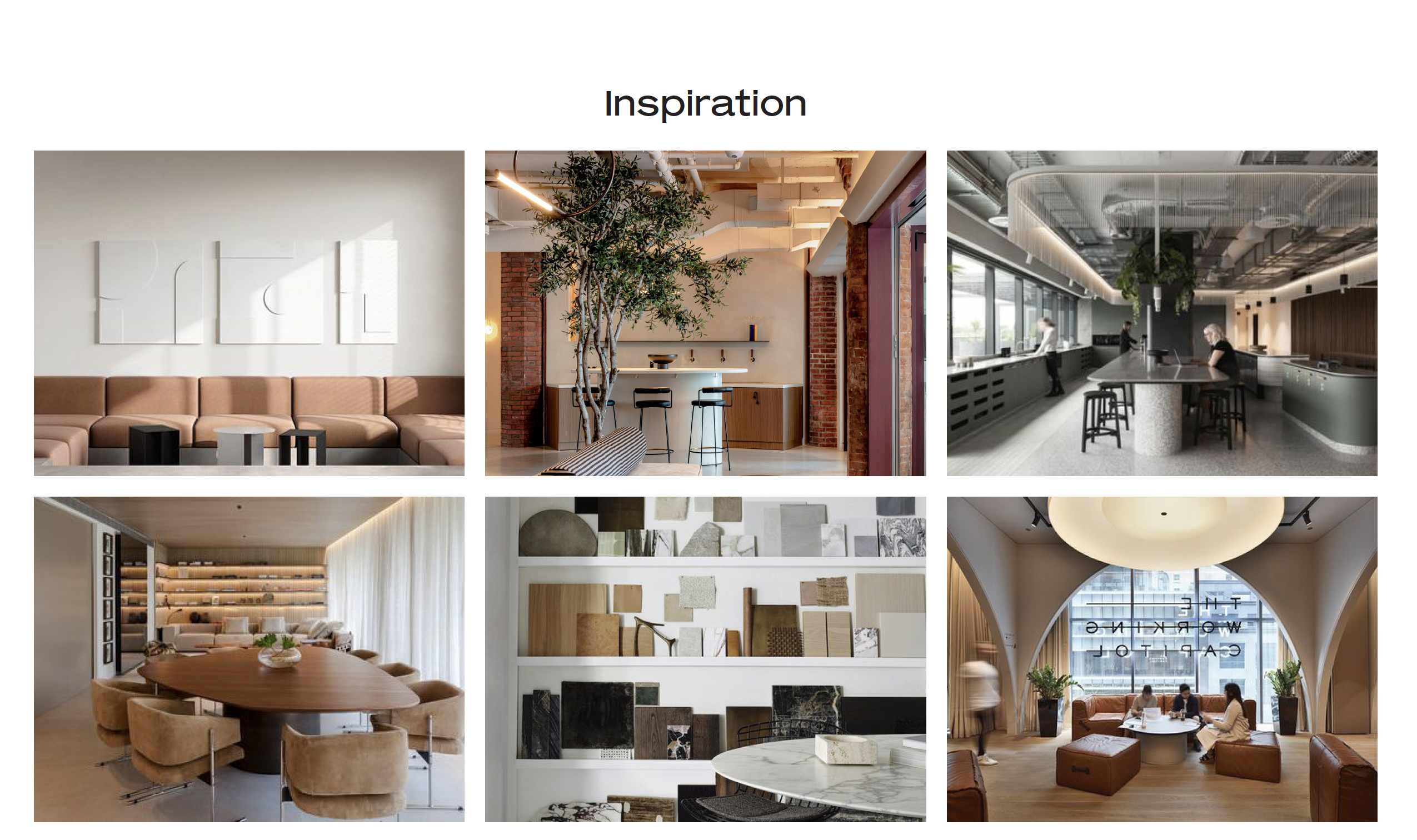
The neutral foundation to our palette provides a clean backdrop allowing our team to display process and in-progress work. Natural, warm materials and soft tones are layered to create a welcoming environment, balancing rich colors and textures that complement the historical finishes within the building.
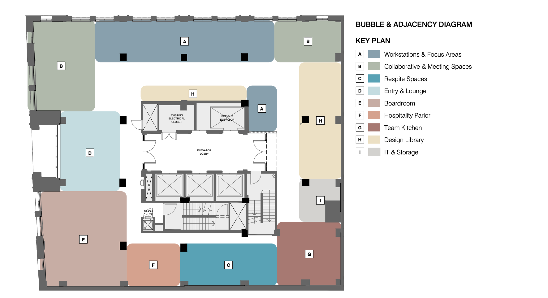
The programming and test fitting of our new HQ began with simple bubble diagrams to iterate on optimized adjacencies and function for the team. We first identified the program needs based on the survey data from our team and gaps in our current space. We then took the time as a team to envision our preferred and ideal methods of working and presence in the future office. It was important to us that our HQ felt more like a vibrant gathering space than a traditional office. A key balance of shared and individual public and private space would allow our team to fluctuate in task and posture throughout the day with ease. Another key program driver was our desire to host and immerse clients and guests within our work and our process. Once we settled on program and optimum adjacency, we began space planning. Our space plans evolved over a few weeks of time and refinements on use case, team feedback, and existing constraints within the site. We eventually landed on a final space plan which will allow us to host clients and guests comfortably with an immersive design lab and collaboration space while also facilitating a productive and diverse working environment for our team.
Our team created multiple iterations of bubble diagrams based on preferred adjacencies and incorporation of all the program needs and amenities we wanted to prioritize for the new space.
We refined several iterations of space plans, pushing ourselves creatively to find the best fit for our future space supporting both our ideal methods of working and crafting a thoughtful, innovative experience to host our clients and guests.
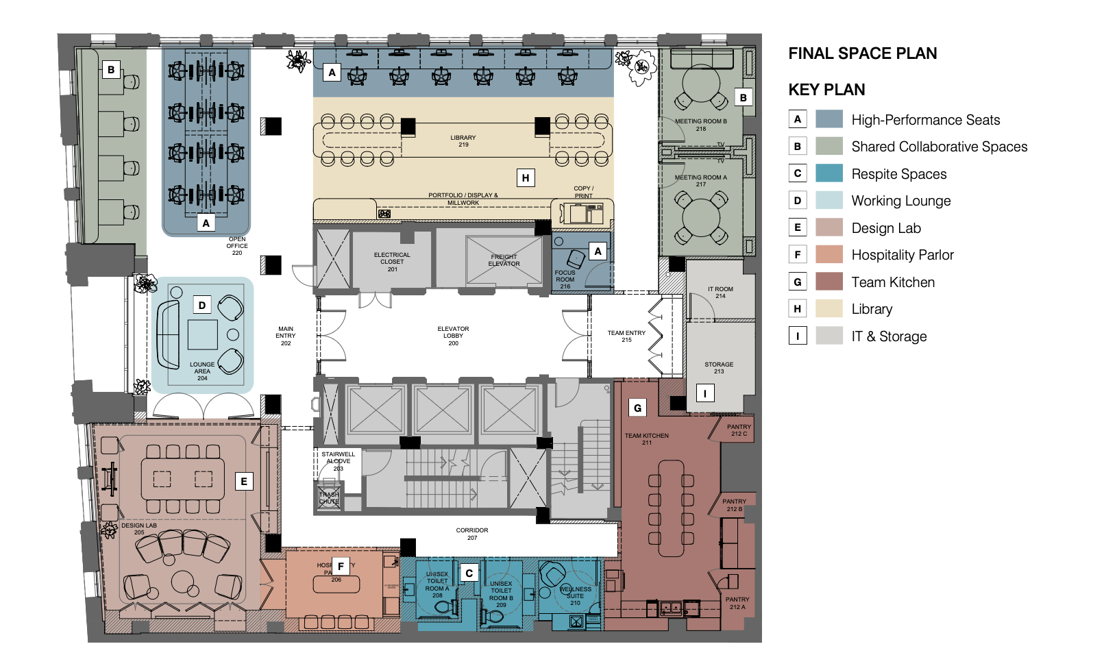
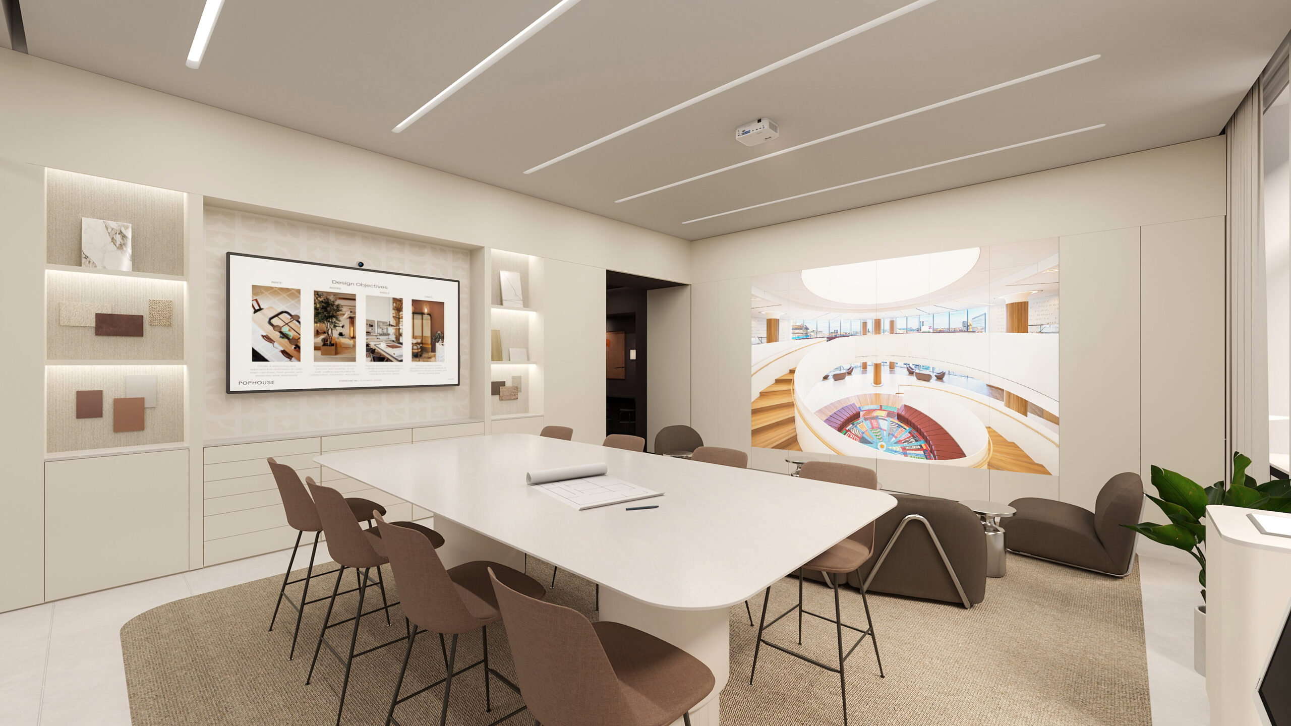
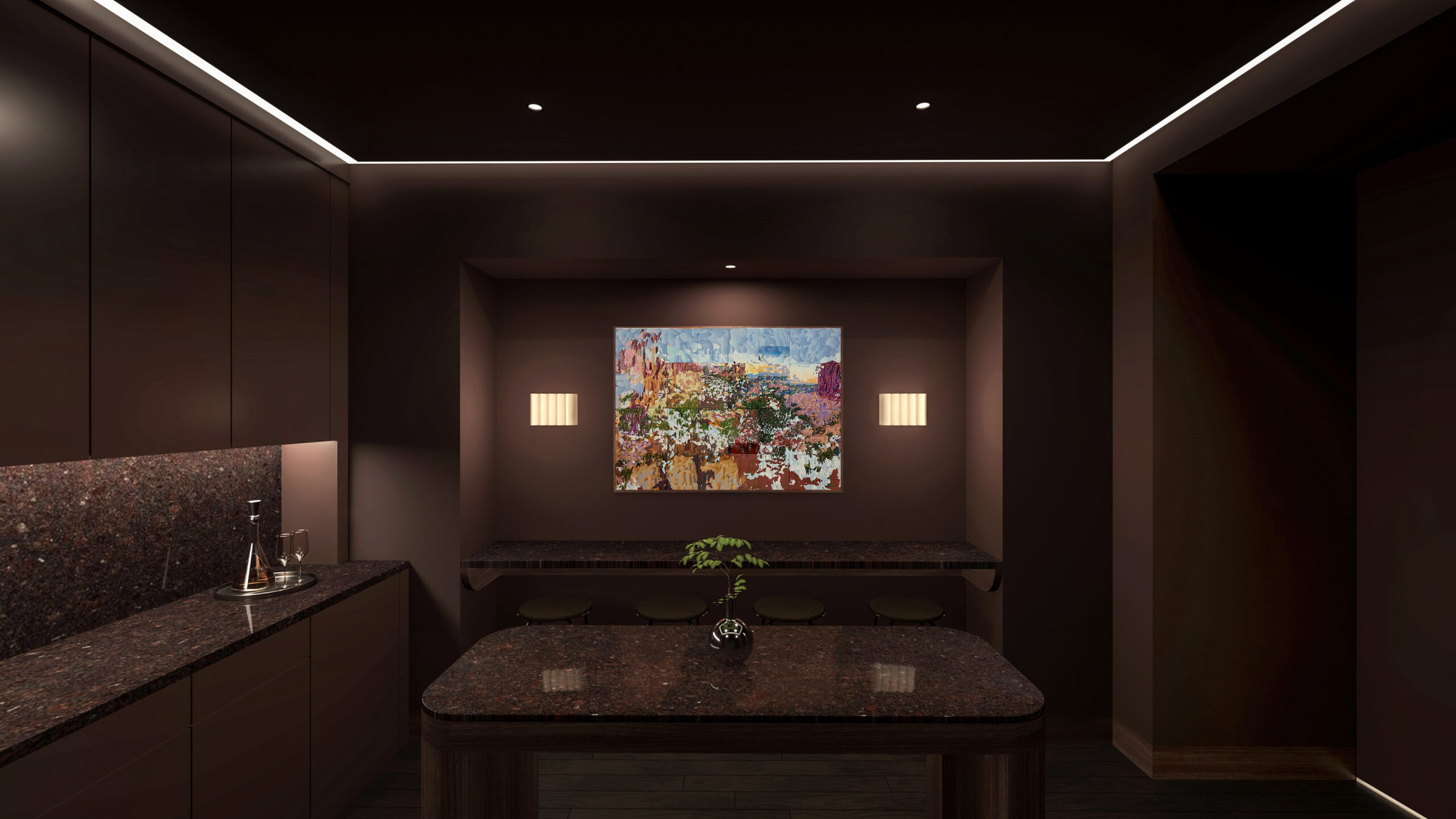
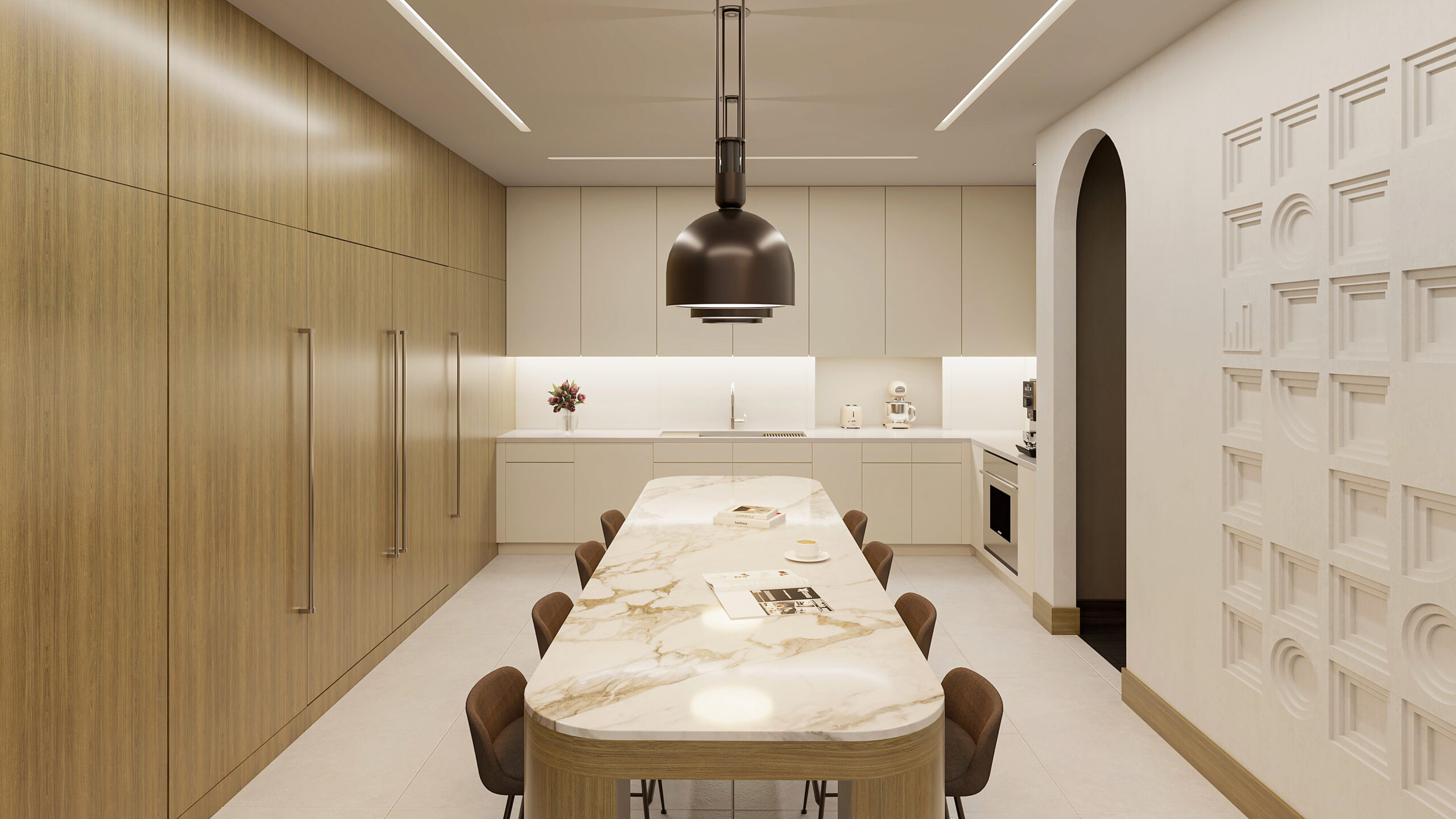
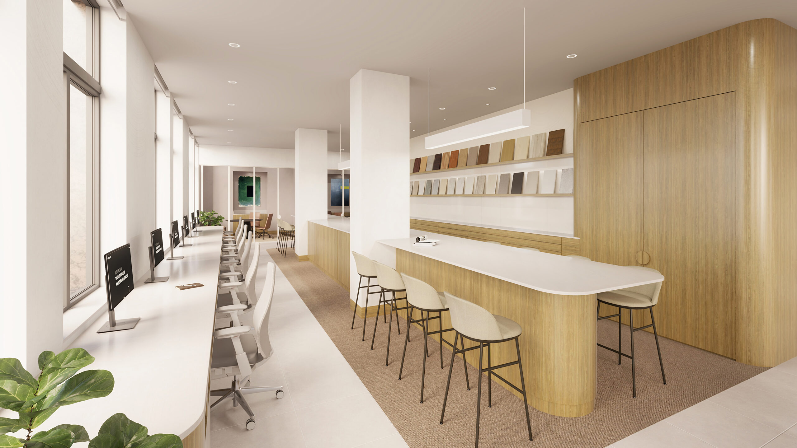
Our final space plan offers an engaging studio experience, celebrating our design lab and library as collaboration space for our team and immersing our clients and guests within our work and process.

Next Story
