5 Principles of Great Brand Design
 Read Below
 Read Below
5 Principles of Great Brand Design
First impressions matter. Having a strong brand design is crucial to the success of any organization. Even if your product or service is top-notch, it will not get noticed if it is hidden behind outdated visuals and cliché platitudes. Great brand design is integral to give your company a clear voice and more importantly, make people listen. It provides you with the ability to stand out in the market, build trust, get recognized, and form connections with clients. Branding weaves its way throughout your organization; from the merchandise you wear, to the presentations you lead, to the logo you stand behind. Through our research-based approach, we create bespoke experiences through both digital and physical formats. We base our brand design on 5 core principles.

In today’s digital age, people can spot authenticity a mile away. According to Oberlo, 88% of consumers deem authenticity a key deciding factor when they decide who they like and support. If your company’s culture does not align with the brand it lives within, your growth will be stunted as an organization. Mission statements that throw our platitudes about “trust” or “doing the right thing” aren’t cutting it anymore. Pophouse has distilled our ethos into four core values: Curious, Purposeful, Authentic, and Fearless. We reject the cookie cutter mold that firms can take when approaching design and push the boundaries with form and function to back up every decision we make. What specifically differentiates your organization from everyone else? What is the essence of who you are and what goal you are trying to achieve? When your culture aligns with your brand, people can sense it, and that builds trust. It’s not just about looking or sounding good; it is about being real and making a lasting connection with your audience.
The world does not stand still, and neither should your brand. You should be constantly evolving your brand to adjust for the current media landscape and making decisions with longevity and ability to pivot in mind. On average, a brand has a shelf life of about 5 years. You should be open and willing to refresh your brand identity to keep up with macro trends in the design world. Evolving with the times ensures you stay relevant and resonate with your audience.
When we transitioned from Dpop! to Pophouse in 2019, the company pivoted to a more buttoned up, minimal design style to elevate the brand for a more focused clientele. Monochromatic palettes, simple shapes, and a striking, modern website were curated to propel us forward as an organization. This evolution also followed the cultural zeitgeist as the design world moved away from the bright, tech-inspired motifs of the 2010’s. While this rebrand has remained successful through the pandemic, there have been notable evolutions in the design world that we are adapting to. Warmer tones and a more natural photography style are being integrated into our brand as well as a website refresh to add an element of warmth and accessibility to Pophouse.

You should be open and willing to refresh your brand identity to keep up with macro trends in the design world. Evolving with the times ensures you stay relevant and resonate with your audience.
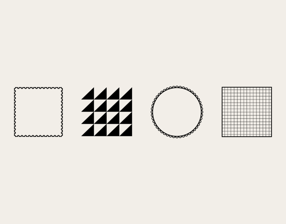
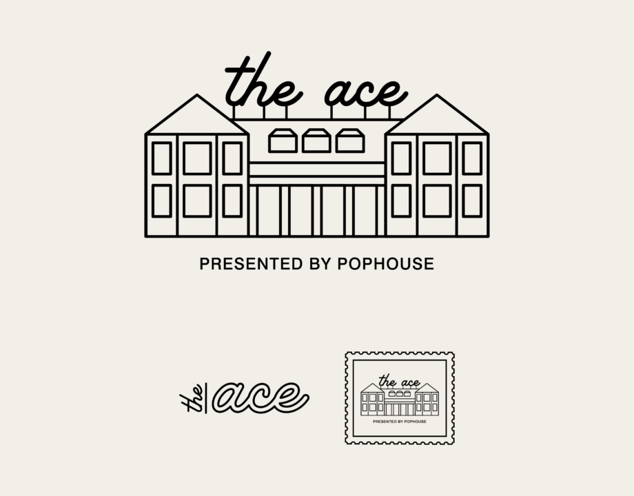
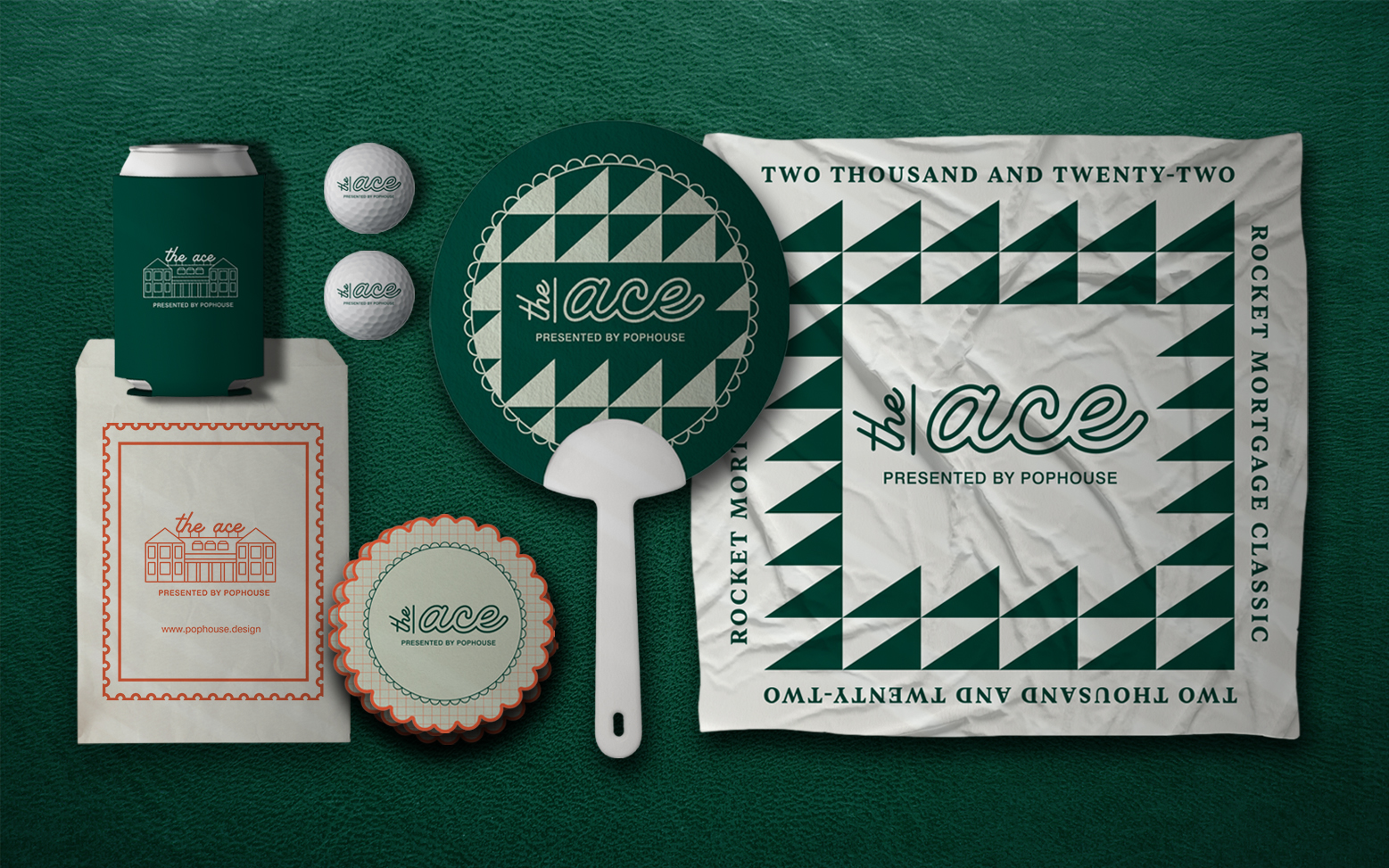
The call to “disrupt the market” is often overused. Good brand design sets you apart from competitors but keeps you in the arena. A fitting example of this concept was our short-term activation for Rocket Mortgage Classic, The Ace. Pulling inspiration from golf patterns in a over exaggerated approach to emerce our guest tradition, The Ace effectively created a distinct, VIP experience for the tournament viewers while feeling authentic to the audience. It would be easy to throw together a image of a golf ball and make a simple, on the nose brand for the experience, but instead we decided to dig deeper into the history and culture of golf. Pulling from Scottish tartan and maximalist style, The Ace embraces bespoke vintage golf elements and pulls it into the 21st century. The brand exudes old-school golf style without once verbalizing it.
Subtle, thoughtful decisions within your brand design make a big impact. Embracing distinction without alienating yourself from what makes your organization identifiable ensures you stay true to your core service while remaining innovative and captivating for your audience.
Typography is so much more than just the words on the screen. Typefaces convey moods, can provide credibility, and creates visual contrast throughout your work. When picking the right fonts for your organization, it is important to examine not only where you’ll be using your font families, but how. Some companies may want a simple, sleek, modern font to reflect luxury, and others may want to be able to play around with bold, decorative fonts if they rely heavily on experimental graphic design within their website and social media. For logo design, opting for custom fonts can convey your brand personality and be a differentiator from competitors in the market. Typography is the silent communicator. Paying attention to this seemingly small detail can make a significant difference in how your brand is perceived.
Typography can be a huge factor in garnering buy-in from clients. It sends off subtle cues about your brand consistency and the trust that forms from that. If you are sending mixed messages to your clients through inconsistent font choices, it shows a lack of confidence. If your organization cannot agree on a consistent set of fonts to use to represent yourselves, how would a client be able to trust you to make strong, concrete decisions on their behalf? Your brand’s typography signals a dedication to the smallest level of detail, and stakeholders take note of that.
Your brand does not stop at your style guide. It needs to be integrated into every minute detail of your organization for it to truly be effective. Of course, external documents, websites, and social media posts need to adhere to the guidelines, but so do the small things like email signatures, internal documents, excel sheets, and everything in between. If your brand is warm and inviting, your photography needs to reflect that. If your brand is minimal and clean, you cannot have a cluttered break room. Immersive spaces authentically communicate your brand. Our headquarters was designed to be the physical manifestation of our brand. Our material palette was carefully chosen to reflect our brand colors and our environmental graphics were crafted based on our iconography used throughout our collateral. Organic motifs and materials are incorporated throughout to promote a clean slate for creative collaboration. Like an ecosystem, these small elements need to live in harmony for your brand to feel natural and seamless.
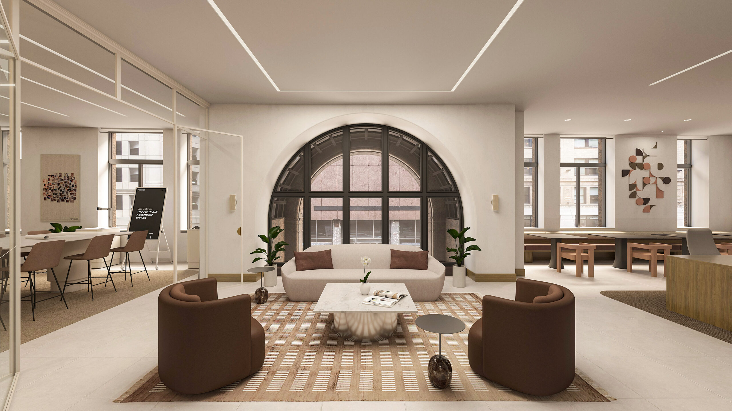
A high-quality brand is not about a singular logo, font, or color; it is the entire experience. When every aspect of your organization reflects your brand, it creates a cohesive and memorable impression. Carve your niche in the market, build trust and credibility, increase recognition, and create emotional connections with clients.
